Color map
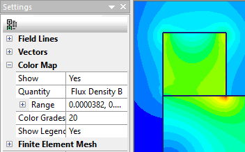
Shows distribution of a chosen scalar quantity. The color map is accompanied by the legend showing the correspondence between colors and numerical values.
You can adjust the color scale by changing the range limits for the chosen quantity.
Main >> Support >> QuickField Help Shows distribution of a chosen scalar quantity. The color map is accompanied by the legend showing the correspondence between colors and numerical values.
You can adjust the color scale by changing the range limits for the chosen quantity.
Color map